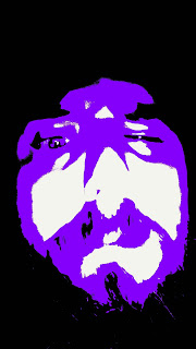
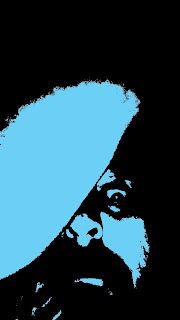
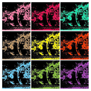
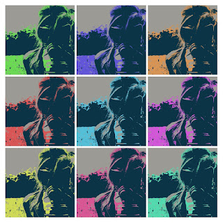
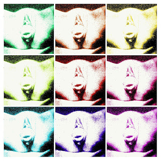
For argument and an example lets use this mix...... Yes that is me.
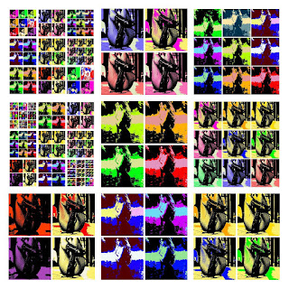
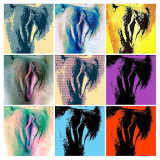
Now the program I used to make the proof did not do a fair job of keeping the images level. As you can see some of my face are up higher and others were dropped lower. but these 9 are a grouping I'd look at.
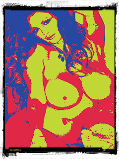
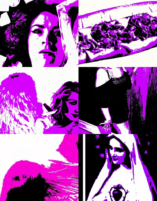
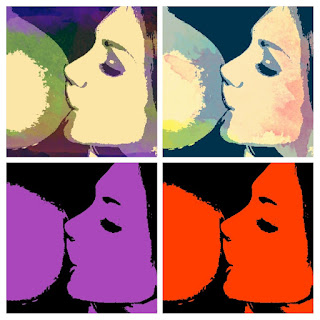
The center one of all is faded. I'm not sure what happened color wise there but this would be a direct pull where I would return to the others I've made of this image and try to find one where the color is stronger. Top right is ok, but it's a bit off with my printing of Demon across the forehead. so I would probably rethink that one. Then from there I'd sort it down to which reverberate with me better. I tend to prefer red and purple color wise as it does give a variation and make images pop. Now much of this is before I got into a pop art style where I learned it works best with a 3 color palette so you have lights darks and accent. lets give an example here.
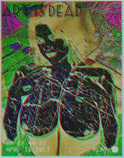
Now where it pops a bit more and on some you can see where I extended the palette.
Also they look 1000x better than previous images.
now this is just a taste of what runs through my head before I post images and/or set them for sale.
-Jebus


